In the visual language of pop culture, a font is never just decoration. Instead, it acts as a psychological anchor. For Taylor Swift’s album, each fonts in typography becomes a visual preamble to her emotional state. From one album to the next, her fonts signal change. By examining the scripts of Fearless, the brushstrokes of Lover, and the classic serifs of folklore, we can trace a clear evolution—from youthful idealism to grounded maturity.
A Descriptive Analysis of Taylor Swift’s Most Iconic Album Fonts
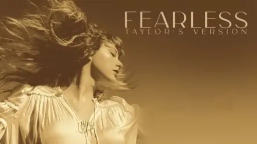
1. Album Fearless’s Fonts: The Flourish of Youthful Idealism
During the Fearless era, Taylor Swift’s typography album leans heavily into ornate script. It resembles a fairytale title or a handwritten diary. Most notably, the letters feature dramatic flourishes. These sweeping curls and extended loops dominate the capital letters.
Psychologically, such exaggerated loops reflect imagination and emotional openness. Moreover, the font balances structure with whimsy. This combination suggests a personality still captivated by romantic fantasy. The upward strokes reach toward possibility. As a result, they symbolize optimism and aspiration. At this stage, Taylor Swift’s projects her dreams onto a golden stage. Ultimately, the album fonts captures a heart untouched by industry pressure.

A Descriptive Analysis of Taylor Swift’s Most Iconic Album Fonts
2. Album Lover’s Fonts: The Fluidity of Intimacy and Vulnerability
In contrast, the Lover era abandons rigid elegance. Instead, it embraces a hand-drawn brush script. The letters appear wet and textured, as if painted quickly. The edges feel soft. Notably, sharp angles disappear altogether.
One defining feature stands out: the rightward slant. In graphology, this tilt suggests emotional openness. It signals movement toward others. Furthermore, the thick, dense strokes add warmth. They create a tactile, almost intimate feeling. This fonts does not hesitate. Rather, it leans fully into romance. As a result, it reflects emotional safety, vulnerability, and trust. Above all, it represents the courage to love openly.
A Descriptive Analysis of Taylor Swift’s Most Iconic Album Fonts
3. Album folklore’s Fonts: The Elegance of Introspection and Ego-Loss
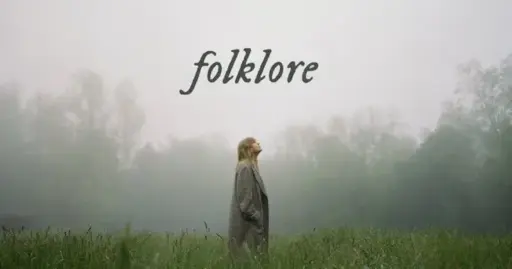
Then comes folklore. This era marks the most dramatic visual shift. Taylor Swift leaves handwriting behind. Instead, she adopts a classic serif typeface. The fonts letter are appear thin, italicized, and entirely lowercase.
Visually, the font evokes an old novel. It feels like a poetry book found in a quiet cabin. The serifs add tradition and structure. However, their delicacy suggests fragility. Most importantly, the lowercase choice carries psychological weight. It softens the presence. It quiets the ego. In doing so, Taylor steps away from celebrity. She becomes a storyteller instead. Consequently, the font reflects introspection, isolation, and emotional depth. It prioritizes legacy over visibility.
The Final Verdict of Taylor Swift’s Album: A Visual Journey of Self-Actualization
Viewed together, these eras reveal more than branding changes. They map emotional growth. The journey begins with sky-reaching loops, fueled by dreams and validation. It then shifts into grounded strokes that value safety and connection. Finally, it settles into restrained serifs that strip away ego.
In essence, this evolution mirrors self-actualization. It moves from performance to presence. From noise to meaning. From stage lights to forest air. As Taylor’s inner world changes, so does the way she writes herself into the world.
Unlock the Secrets Between the Lines
Intrigued by how a single stroke can reveal personality? Handwriting tells stories beyond fame. If you want to explore the psychology behind letters and lines, dive deeper with Sunday Lessons by the KAROHS School.