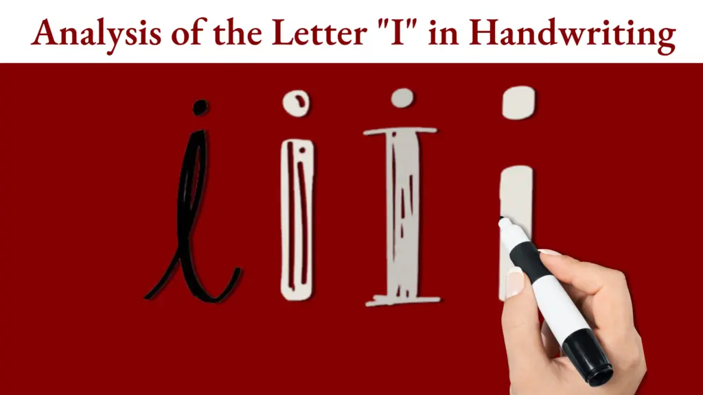
Handwriting has always carried a unique charm, something deeply personal, expressive, and quietly intimate. In an era dominated by digital text, handwritten words stand out as a visual experience in themselves. Some handwriting appears effortlessly beautiful, while others feel chaotic or emotionally heavy. But what actually makes handwriting look “aesthetic”? From a graphology point of view, aesthetic handwriting goes beyond pretty shapes; it reflects harmony between movement, personality, and emotional rhythm. The appeal comes not only from how the letters look, but from the psychology that shapes them.
What Makes Handwriting Look “Aesthetic”? A Graphology Perspective on Visual Appeal
The Balance Between Control and Freedom
Aesthetic handwriting often strikes an organic balance between structure and fluidity. From a graphological perspective, handwriting that looks visually pleasing usually shows evidence of controlled strokes, lines that keep their direction, curves that maintain consistent roundness, and proportions that do not deviate dramatically. Yet it is not rigid. The freedom of movement keeps the writing alive, creating a rhythm that feels natural rather than mechanical.
This balance mirrors the writer’s internal state. Someone with a moderate and graceful level of self-discipline tends to produce handwriting that appears structured without being harsh. On the other hand, when movement becomes overly restrained, the writing may feel stiff, while excessive looseness can lead to messy, disorganized strokes. Aesthetic handwriting thrives where these two forces meet, creating a harmonious flow.
Consistency, Rhythm, and Visual Harmony
Another key element is consistency. When spacing, slant, pressure, and size remain relatively stable, the handwriting appears cohesive and visually pleasing. Graphology views consistency as a sign of emotional stability and cognitive clarity. Even if the handwriting style is small, large, or uniquely stylized, maintaining a consistent approach across the page creates a sense of rhythm.
Rhythm is one of the most important contributors to aesthetic appeal. Think of handwriting as a visual form of music: letters, loops, and connections create beats, pauses, and patterns. When these visual beats repeat harmoniously, such as consistent letter height or balanced connections between words the handwriting becomes satisfying to look at. The eye appreciates predictability and flow, and graphology frames this as an outward expression of an organized mind.
Spacing and the Beauty of Breathing Room
Spacing often distinguishes handwriting that looks “aesthetic” from writing that appears cramped or overwhelming. In graphology, spacing reflects how a person manages boundaries and interpersonal distance. Aesthetic handwriting tends to have comfortable spacing, neither too wide nor too tight allowing the words to breathe on the page.
Wide spacing suggests openness and clarity, giving the writing a clean, airy appearance. However, overly wide separation can feel disconnected or cold. Conversely, tight spacing creates visual density that may look intense or cluttered. Aesthetic handwriting usually achieves an elegant middle ground, where letters and words maintain familiarity without suffocation. This sense of balance is one of the reasons certain handwriting styles feel calm, polished, or even luxurious.

What Makes Handwriting Look “Aesthetic”? A Graphology Perspective on Visual Appeal
Personal Style and the Appeal of Authenticity
Interestingly, handwriting becomes more visually striking when it reflects the writer’s authentic personality. Graphology emphasizes that aesthetic beauty does not require perfection or uniformity; instead, it thrives on individuality that is expressed with intention and coherence. For example, some people have angular writing that looks modern and sharp, while others have rounded, soft letters that appear gentle and warm. Both can be aesthetically pleasing when they display internal logic.
What the viewer perceives as “aesthetic” is often the emotional resonance of the writer’s energy, expressed through form. Authentic handwriting carries a sense of story, something uniquely human that typed fonts cannot fully replicate.
Aesthetic Handwriting as a Reflection of Inner Balance
Ultimately, what makes handwriting look aesthetic is the harmony between psychological expression and visual presentation. From a graphology perspective, beauty emerges when the writing reflects balanced energy: organized yet fluid, consistent yet personal, expressive yet controlled. The aesthetic appeal lies not only in the shapes of the letters, but in the inner world they reveal.
Handwriting that captivates us does so because it feels alive, intentional, and in tune with the writer’s emotional rhythm. And in that harmony, a simple line of text becomes a form of art. Make your own art by handwriting and join Sunday Lessons by KAROHS.