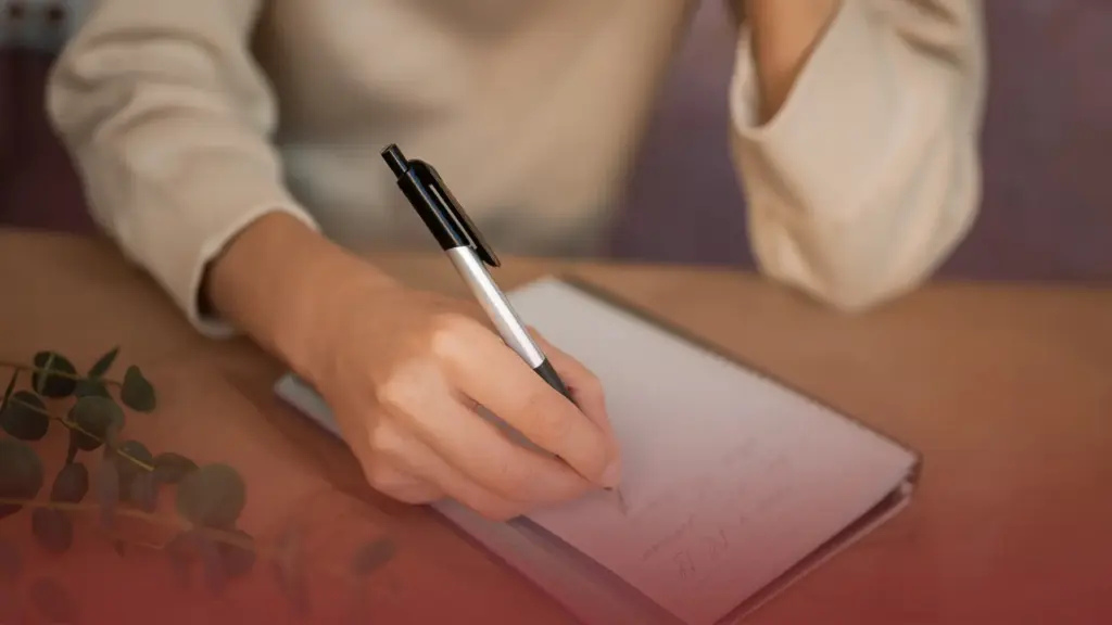
Zootopia is known for its colorful characters and strong personalities, each breaking stereotypes in their own way. But what if these characters expressed themselves not only through actions and dialogue but also through handwriting?
Through a fun and imaginative graphology lens, we can explore what their handwriting might look like if they ever put pen to paper. This is not a scientific analysis, but an entertaining way to connect personality traits with writing styles, just like reading between the lines of a character’s behavior.

What Would Zootopia Characters’ Handwriting Look Like?
Judy Hopps: Neat, Focused, and Full of Drive
Judy Hopps, for instance, is ambitious, disciplined, and deeply focused on her goals. Her handwriting would likely reflect this determination through neat, well-organized letters and a consistent structure. The size of her writing might be relatively small to medium, suggesting concentration and attention to detail, while firm pen pressure could hint at her persistence and strong inner drive. Overall, her handwriting would feel purposeful, every line carefully placed, much like her approach to becoming a police officer in a city that doubts her.

What Would Zootopia Characters’ Handwriting Look Like?
Nick Wilde: Smooth, Flexible, and Clever
Nick Wilde’s handwriting, on the other hand, would probably look more relaxed and fluid. Known for his charm and adaptability, Nick is skilled at reading people and situations. His writing might slightly lean to the right, creating a sense of openness and sociability, while the letter shapes themselves would appear flexible rather than rigid. The pressure of his pen would likely be moderate, reflecting emotional control and a cautious nature shaped by past experiences. His handwriting would flow smoothly, mirroring his clever and easygoing demeanor.

What Would Zootopia Characters’ Handwriting Look Like?
Flash: Wide, Round, and Unrushed
Flash the sloth, of course, would bring a completely different energy to the page. His handwriting would likely be large, rounded, and widely spaced, reflecting a relaxed and unhurried mindset. The pressure of his pen would probably be light, suggesting calmness and low stress. Even though it might take him a long time to finish a sentence, his handwriting would feel peaceful and easy, perfectly aligned with his famously slow pace.
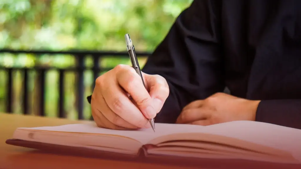
Just like handwriting in real life, the imagined writing styles of Zootopia characters highlight individuality rather than conformity. The film encourages viewers to look beyond labels, and this fun graphology perspective does the same by exploring personality in a creative and non-judgmental way. In the end, handwriting becomes another storytelling tool, one that adds depth and personality to characters we already love.
If Zootopia characters truly had handwriting, it would be as diverse as the city itself. Each stroke, curve, and spacing would quietly reflect who they are, reminding us that even the smallest details can tell a bigger story. Discover the fun side of graphology with Sunday Lessons by KAROHS, where handwriting becomes a tool for self-awareness, creativity, and insight.