
At KAROHS International School of Handwriting Analysis, we believe that growth is not only about learning new things but also about evolving with the times. Since our inception, KAROHS has stood as a beacon of excellence in handwriting analysis, providing top-tier education and certification to thousands of students around the world. However, as times change, so must we. This is why we have taken a bold step forward with a new brand identity, including a fresh, modern logo that better represents who we are today and where we are headed.
A Legacy of Excellence
Even before the name ISHA (International School of Handwriting Analysis) came into existence, Dr. Erika M. Karohs had already established a robust handwriting analysis system. Her early work included extensive research, the development of analysis techniques, and the creation of proprietary methodologies that became the foundation of KAROHS’ comprehensive curriculum. Dr. Karohs’ dedication to handwriting analysis began long before KAROHS was officially founded, showcasing her pioneering spirit and the depth of expertise that KAROHS embodies today.
For decades, KAROHS has maintained an unwavering commitment to delivering high-quality, scientifically-backed handwriting analysis education. Founded by Dr. Erika M. Karohs, our curriculum and methodologies are deeply rooted in research and real-world application. Our vision has always been clear: to be the gold standard in handwriting analysis worldwide. This vision remains our guiding light as we step into a new chapter.
Why the Change?
The decision to rebrand, including introducing a new logo, was not made lightly. It is part of our broader strategy to remain relevant in a fast-changing world. We wanted a visual identity that reflects our values of mastery, credibility, excellence, and empowerment. Our new logo is more than just a design; it is a symbol of our promise to support those with a strong desire to succeed and become leaders in their fields.
The Evolution of Our Logo
Our logo has undergone significant evolution over the years. Initially, our institution was known as the International School of Handwriting Analysis (ISHA) with a sleek, modern logo that emphasized professionalism and credibility.
When we rebranded to KAROHS International School of Handwriting Analysis, we introduced a new logo with a 3D design featuring gold, white, and vibrant colors. This design symbolized the legacy and prestige of KAROHS and reflected our commitment to excellence and tradition.
In 2022, we transitioned to a simpler, flat design with a maroon color scheme. This change aimed to modernize our visual identity and present a more streamlined look. The maroon design maintained the core elements of our brand while adapting to a cleaner and more contemporary style.
With our 2025 redesign, we took a bold leap forward by not only refreshing our visual style but also redefining our brand identity. This time, the change was more than aesthetic; it was about encapsulating our brand’s philosophy through meaningful symbolism. The new logo is a powerful representation of our mission to inspire leadership, self-mastery, and excellence.
We look forward to showcasing the evolution of our logo from the early ISHA design, through the 3D gold version, then to the flat maroon design, and finally to the latest emblem that embodies the vibrant spirit of KAROHS today.
The Story Behind the New Logo
Our new logo incorporates several meaningful elements:
The Shield: Symbol of Protection & Integrity
- The shield shape stands for protection, credibility, and trust.
- It reinforces that KAROHS upholds the highest standards in handwriting analysis, offering knowledge that is valid, credible, and reliable.
- The shield also represents resilience and steadfastness—emphasizing that those who understand themselves deeply are better equipped to face life’s challenges.
The Book: Symbol of Knowledge & Learning
- An open book represents education, wisdom, and deep insight.
- It reflects the learning journey at KAROHS, where every individual is invited to discover new perspectives about themselves and the world around them.
- Its horizontal and curved form symbolizes equality and balance, mirroring KAROHS’ objective and science-based approach to handwriting analysis.
The Eagle: Symbol of Leadership & Excellence
- The eagle is the centerpiece of the KAROHS logo, symbolizing true leadership—those who are bold enough to master themselves in order to reach the heights of success.
- Sharp Vision – Just like an eagle that sees far ahead, those who understand themselves clearly will have a sharper vision for life.
- Excellence & Achievement – Eagles soar high and do not compete with birds below. This reflects our “Lead Yourself” philosophy: focus on personal growth, not comparison.
- Freedom & Independence – KAROHS doesn’t just provide knowledge; it empowers individuals to take control of their own destiny.
- The eagle’s placement above the book signifies that knowledge is the foundation of leadership.
The Light: Symbol of Inspiration & Transformation
- The light above the eagle symbolizes enlightenment, inspiration, and the highest achievements.
- It reflects the belief that those who understand and lead themselves will ultimately reach their fullest potential.
- The radiant light also represents KAROHS’ gold standard—The Gold Standard in Handwriting Analysis.
The Initial ‘K’: The Initial ‘K’: Symbol of Identity & Legacy
- The letter ‘K’ is a direct representation of our brand name—KAROHS.
- It reinforces brand recognition and keeps our identity bold and clear.
- The strong and upright design reflects the stability and legacy KAROHS has built over decades.
- It also symbolizes forward movement and courage to take bold steps toward the future, echoing the spirit of continuous growth and leadership.
Each element of the logo is thoughtfully designed to convey our belief that true leadership starts from within. At KAROHS, we aim to cultivate not just professional graphologists but also individuals who lead themselves first, thereby leading others with integrity and vision.
Why These Colors?

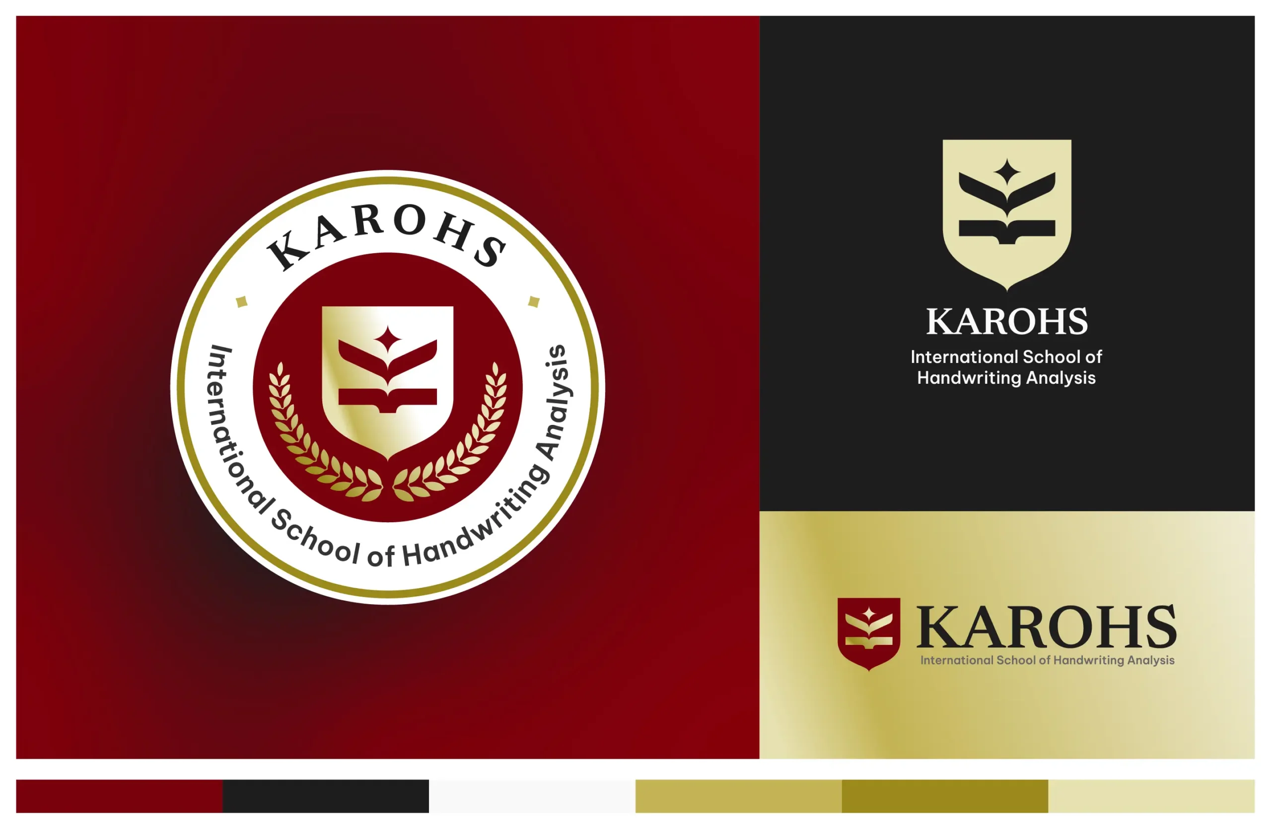
Our new visual identity also incorporates a carefully chosen color palette that aligns with our brand values:

As the primary color, maroon represents strength, passion, and a deep commitment to excellence.

Symbolizes professionalism, sophistication, and credibility, key attributes of our institution.

Acts as a secondary color, offering balance and a sense of openness and transparency.

Complements the gold tones, adding depth and a sense of tradition and legacy.

This accent color evokes a sense of prestige, achievement, and the “gold standard” that KAROHS embodies in the field of handwriting analysis.

Same as the Gold — This accent color evokes a sense of prestige, achievement, and the “gold standard” that KAROHS embodies in the field of handwriting analysis.
Each color was chosen not just for its aesthetic appeal but for the meaning it brings to our brand story. Together, these colors create a harmonious visual identity that reflects our mission to inspire and lead.
What Remains Unchanged
While our look has evolved, our commitment to providing an exceptional learning experience remains steadfast. Our courses continue to offer the same in-depth, scientifically validated handwriting analysis education. The flexibility of our home study program, the support from experienced graphologists, and our comprehensive learning materials all remain unchanged.
Looking Forward
This new logo marks the beginning of a new era for KAROHS. It is a visual representation of our ongoing journey to inspire, educate, and lead. As we move forward, we invite you to join us—whether you are a new student eager to begin your handwriting analysis journey or an alum ready to take your skills to the next level.
At KAROHS, we are more than just a school. We are a community of learners, leaders, and lifelong explorers of human potential. And our new logo is a testament to this vibrant spirit.
Thank you for being a part of our story. The best is yet to come!


